Snapchat Switch
February 20, 2018
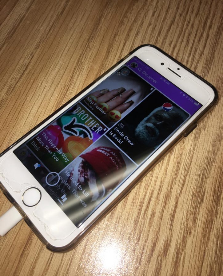
Recently, the popular social media platform Snapchat came out with an update, completely switching the layout of the app, and there are many mixed feelings. Several teens at Kennedy High School despise it, and have even started petitions to change it back, while others like the update, and think that it’s an improvement.
“It’s annoying because when I’m trying to look at the Snapchat stories, it’s so easy to accidentally click to text them, so it looks like I’m trying to send them something,” Gaby DuPont, fr., said. “Plus, it’s irritating to have to go to a different screen to watch the celebrities’ stories.”
Senior Emily Hohneke expressed distaste towards the update regarding the formatting, along with DuPont, claiming that it’s too busy.
“I feel like Snapchat combined too many elements of the app onto one page, with having the personal messaging and stories in the same spot,” Hohneke said.
On the updated version of the app, the left side of the screen is where you reply to messages, photos, and watch stories, while the middle is where you take your photos. The right side is where you view celebrities’ stories.
“The app looks like it’s meant for a 4-year-old’s. It’s so confusing and cluttered, while it used to look very sleek and ordered,” DuPont said.
There are some students here at Kennedy that think that the app has improved because of the update.
“Making such a big change was a great use of money, and it saves so much space by condensing many of the elements into one page, so you don’t have to slide between screens,” Rahma Elsheikh, fr., said.
Elsheikh also enjoys different aspects of the update, such as the new fonts and bitmoji’s.
“The bitmoji’s are so much more realistic, and the new different font effects are really cool too,” Elsheikh said.

